SX logo idea brainstorming

racketboy

Established Member
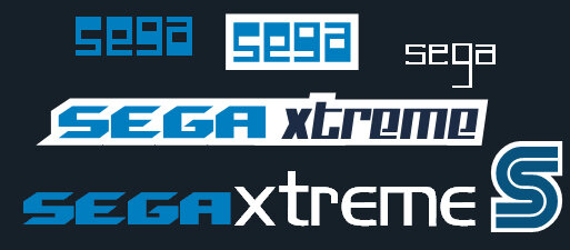
I've been having a fun time tonight playing around in Freehand, so I thought I would play around with logo ideas for the board.

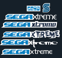
I remember hearing complaints that the old logo is looking long in the tooth.

I'd also like one that looks good with the board skin I use (SX Dark Blue).

I can't really come up with a solid idea yet, but here's some fonts, colors, and such I'm playing around with.

Lemme know what you think.
 

Attachments

  • sxideas.jpg
    sxideas.jpg
    84.1 KB · Views: 113
  • sxideas.jpg
    sxideas.jpg
    84.1 KB · Views: 115
  • sxideas.jpg
    sxideas.jpg
    84.1 KB · Views: 113
Hmm, a little bland... and I don't really think the 'camp' font at the top really suits the whole Sega image at all. I agree that the middle one looks the best, but the kerning really needs work (on all of them, actually), and I don't think the italic font really works with the one on the left... additionally, is that X from a different font as well? Also, you can clearly see that the outline is uneven - that needs to be smoothed out or built by hand.

Anyway, I'm sorry if I'm being too critical, I just like typography a lot, and so I'm pretty picky about this sort of thing. 😉
 
actually I'm not much for any in particular either.

I WANT criticism.

Like I said, I could find a combination I was happy with.

I'll tinker some more.

Any other ideas would be appreciated.
 
Here's round 2

For those who didn't notice, the font I used for Sega on most of this post is the one used for the Genesis/MegaDrive

The 2nd font used for "Xtreme" is the one I used on the SX t-shirts.

The 3rd font used for "Xtreme" is the ones used for Kid Chameleon.

[Contructive] Critcism please
 

Attachments

  • sxideas2.jpg
    sxideas2.jpg
    184.5 KB · Views: 87
  • sxideas2.jpg
    sxideas2.jpg
    184.5 KB · Views: 89
  • sxideas2.jpg
    sxideas2.jpg
    184.5 KB · Views: 85
I like the second 'xtreme' one, but again, the kerning needs cleaning up. Right now the spacing in between the characters is very uneven. I would also consider overlapping the X like in the image attached, maybe a bit more.

I also like the font on the second-to-last one. Maybe give that a black-one-white treatment like the second 'xtreme'? And perhaps enlarge the X and then the 'treme' in next to it?

I think with a 'slick' looking logo, you have to really tighten it up so that any negative space is either eliminated by the characters themselves or filled with something else, y'know what I'm saying?
 

Attachments

  • segaxracket.jpg
    segaxracket.jpg
    9 KB · Views: 73
  • segaxracket.jpg
    segaxracket.jpg
    9 KB · Views: 73
  • segaxracket.jpg
    segaxracket.jpg
    9 KB · Views: 78
ok how's this?
 

Attachments

  • sxideas3.jpg
    sxideas3.jpg
    202.3 KB · Views: 112
  • sxideas3.jpg
    sxideas3.jpg
    202.3 KB · Views: 111
  • sxideas3.jpg
    sxideas3.jpg
    202.3 KB · Views: 108
Thumbs up to the third one. However, I must wonder what it would look like with the traditional SEGA logo font at the front instead of the Genesis/MegaDrive font.

Heh... You must be using the same font website I found when designing the mailing labels for the t-shirts. 😀 I think I ended up using the Chu Chu Rocket font for everyone's names and the Genesis font for the SegaXtreme in the return address.
 
I like the third one too, maybe try bumping the 'treme' up a couple pixels and/or resizing it slightly so that the stroke on it lines up with that of 'Sega'? Either that or offset both sides a bit more (move 'Sega' up and 'treme' down). Also, I think the 'treme' could be stretched out a bit horizontally so that it balances a little more.
 
just to see what it looks like, might work better.

Try using the regular sega font....see what that looks like, could be cool.

possably tilt the X a little clockwise and see how that looks, will help breakup the sega and xtreme a lil.

All this on the 3rd one mind you....
 
Back
Top